Learning photorealistic drawing
A one month sprint to learn to draw realistic portraits
In January 2022, I set myself a challenge: do a photorealistic colour drawing within one month. Here's how it went.
Pre-challenge
My goal for the month is to do a photorealistic colour drawing.
How will I test this?
I plan to show it to 15 people side-by-side with an actual photo for 5 seconds. They will select what they believe to be the photo. If I fool 3 or more of them, then I’ll count that as a success. This would be statistical significance at the 90-something percent level. I’ve no idea if this is even possible, but it feels fun enough to attempt.
Current drawing level
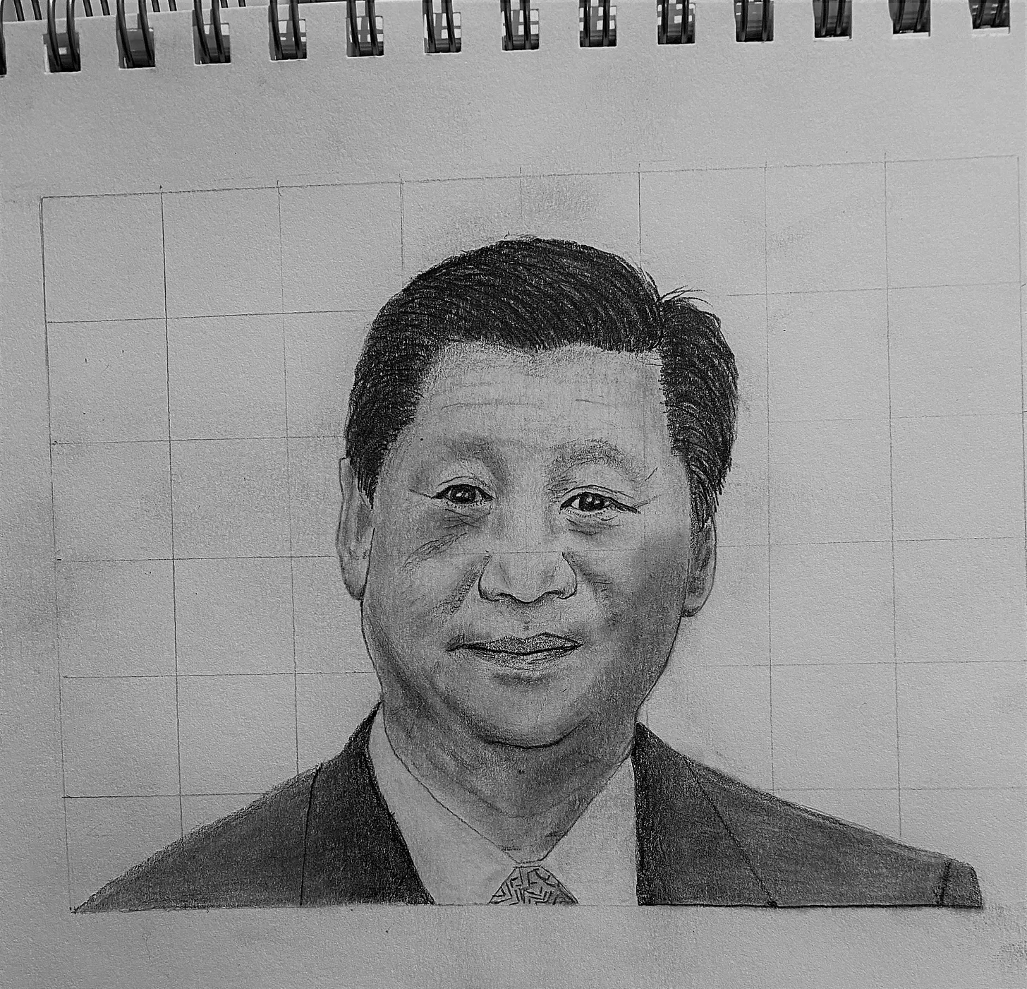
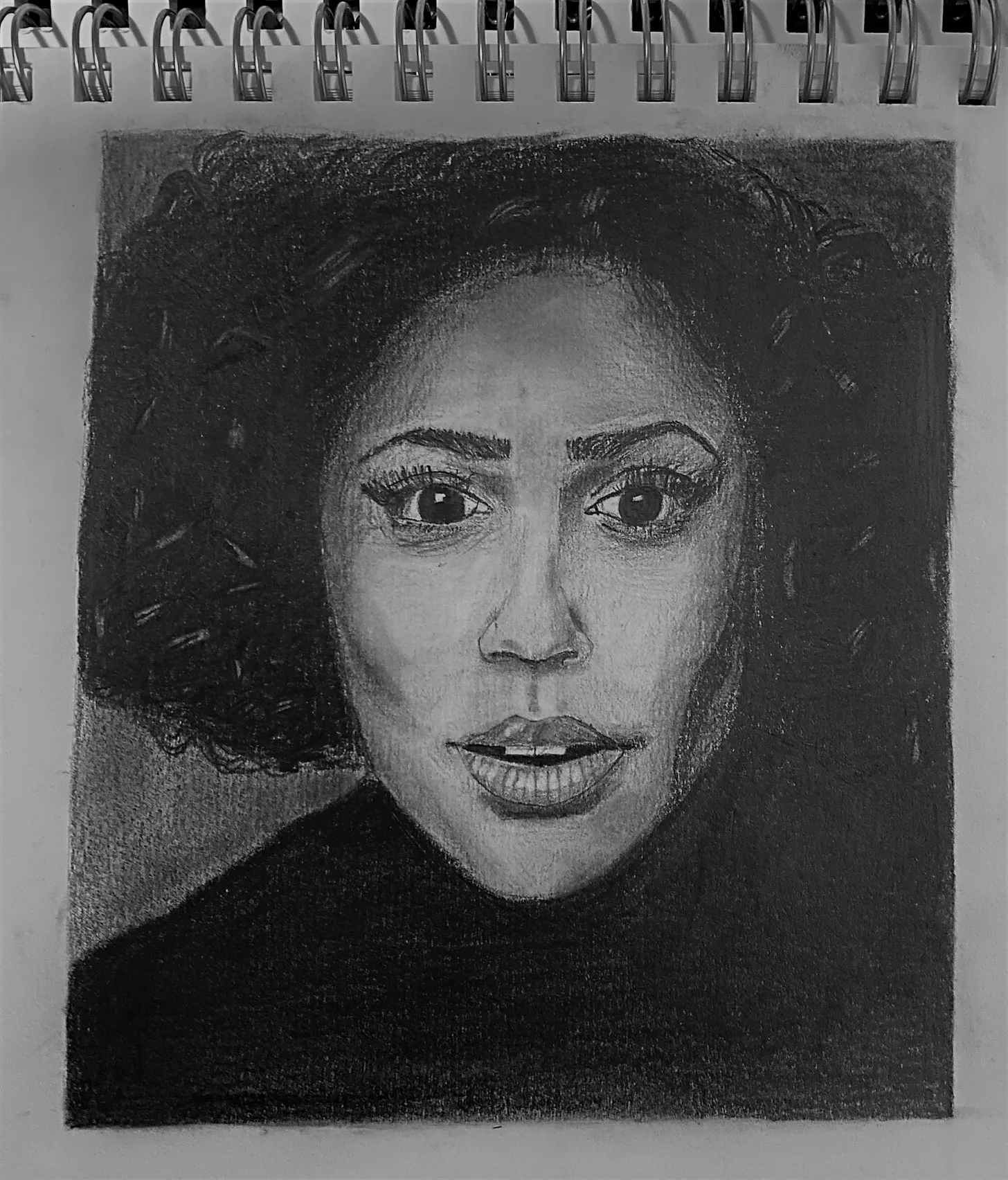
Over the last two months, I’ve been drawing a bit with pencil (examples below). However, until today, I’ve never picked up a coloured pencil. And, while my drawings aren't awful, nobody would mistake them photos.
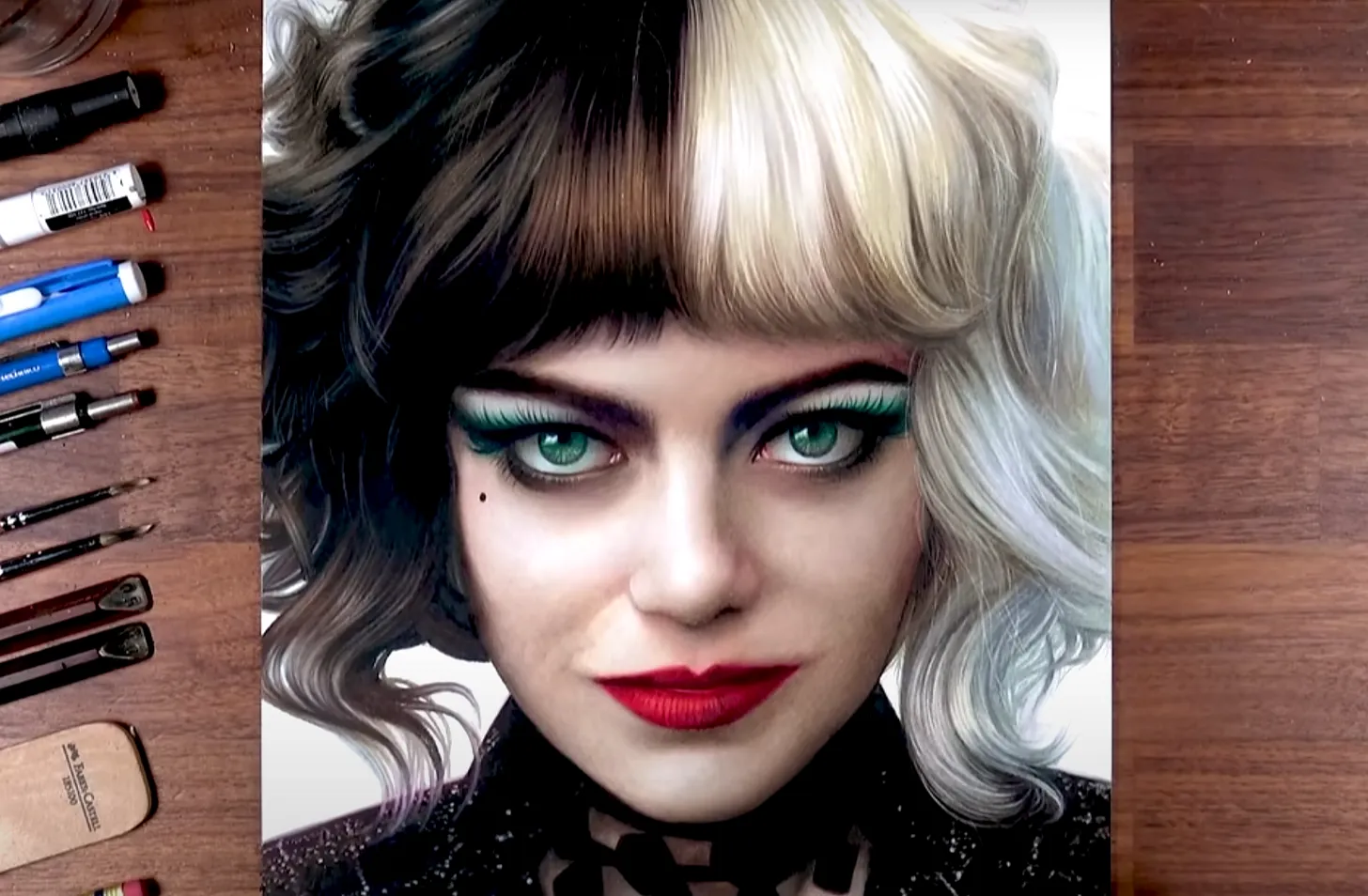
Below is the kind of thing I’m aiming for. Here is the video of them drawing it.
My plan for the month
There are 5 stages to drawing a photorealistic colour image:
- Sketching the outlines (using the grid method)
- Selecting the colours and order to layer
- Shading — getting the right contrast from light and dark
- Blending and texture
- Highlights and finer details
Stage 1 is probably the easiest, but all the other stages will need work.
Here’s my rough plan:
Week 1:
- Work on colour selection — be able to select combinations of colours to mirror any shade in real life
- Do a realistic drawing of an eye
Week 2:
- Work on shading and texture
- Do a realistic drawing of nose and skin
Week 3:
- Work on blending, texture and tools
- Do a realistic drawing of hair and lips
Week 4:
- Work on highlights and finer details
- Do my final drawing (ideally a portrait)
Resources
I’ll mostly be watching Youtube videos of people drawing, trying to copy them in real time. Some useful channels are:
Week 1
This week I:
- Worked on colour selection — to be able to select combinations of colours to mirror any shade in real life
- Tried a realistic drawing of an eye
Here’s how it went.
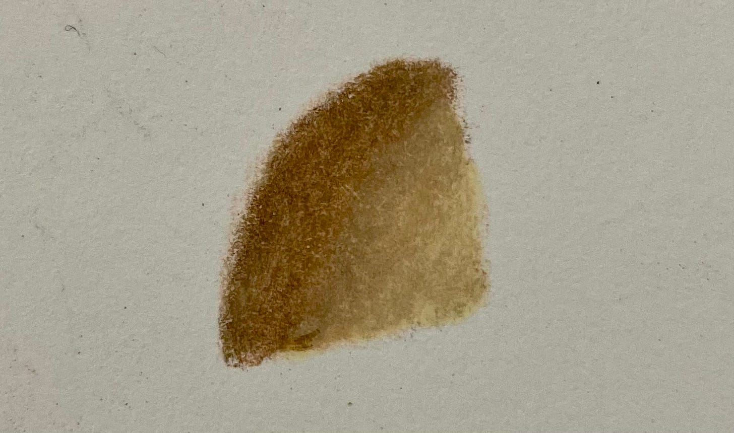
Colour selection
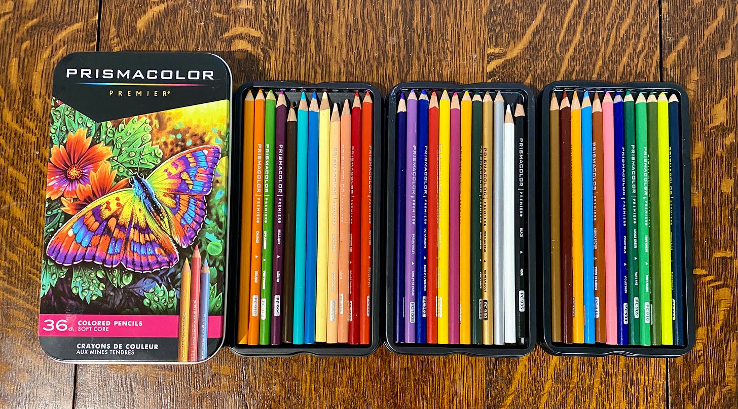
I bought my first set of coloured pencils. You can probably tell which ones I used most this week.
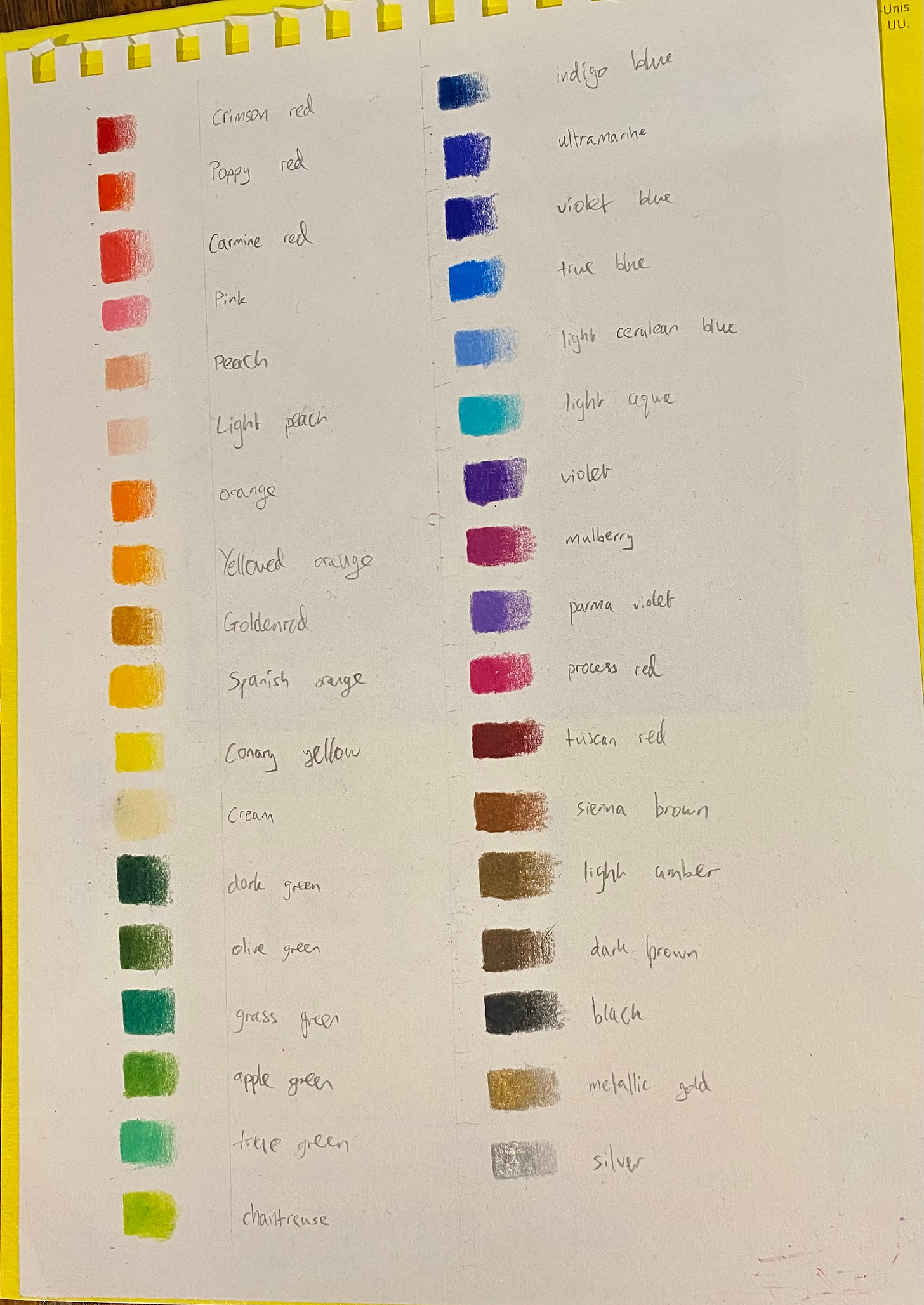
To make any colour shade, you need to layer a selection of colours and then blend them together. First, I got to know the colours I had, by drawing a colour chart:
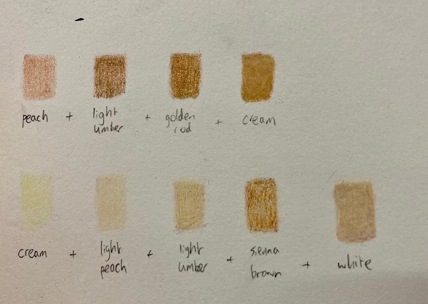
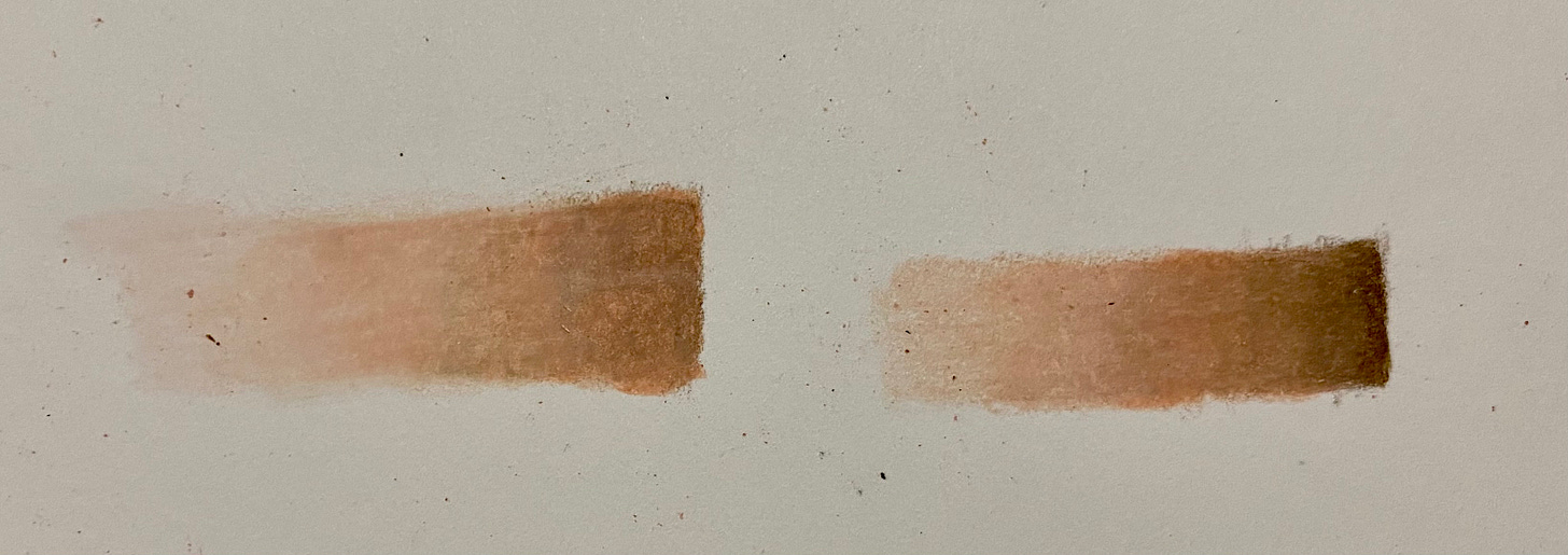
Then I tried layering different colours to see what I could make
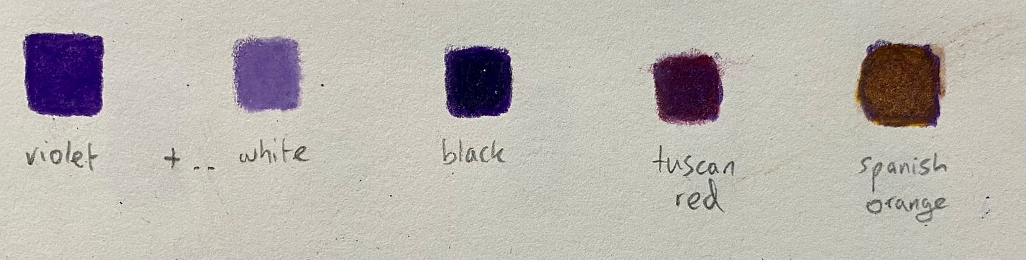
If you want to make a colour, there are really only three things to pay attention to:
- Hue: the actual colour e.g. is it red, green, blue, or how far is it around the colour wheel
- Saturation: how vibrant or grey it is
- Value / luminance: how dark or light it is i.e. how close is it to the centre of the colour wheel

You can change these all by adding different colour pigments:
- Hue: pick a different colour towards the hue you want
- Saturation: add grey or black + white
- Value / luminance: add black or white
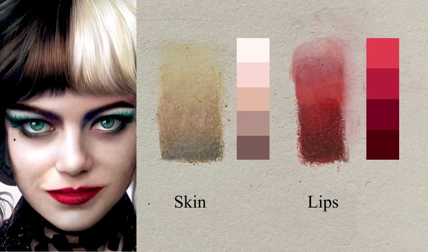
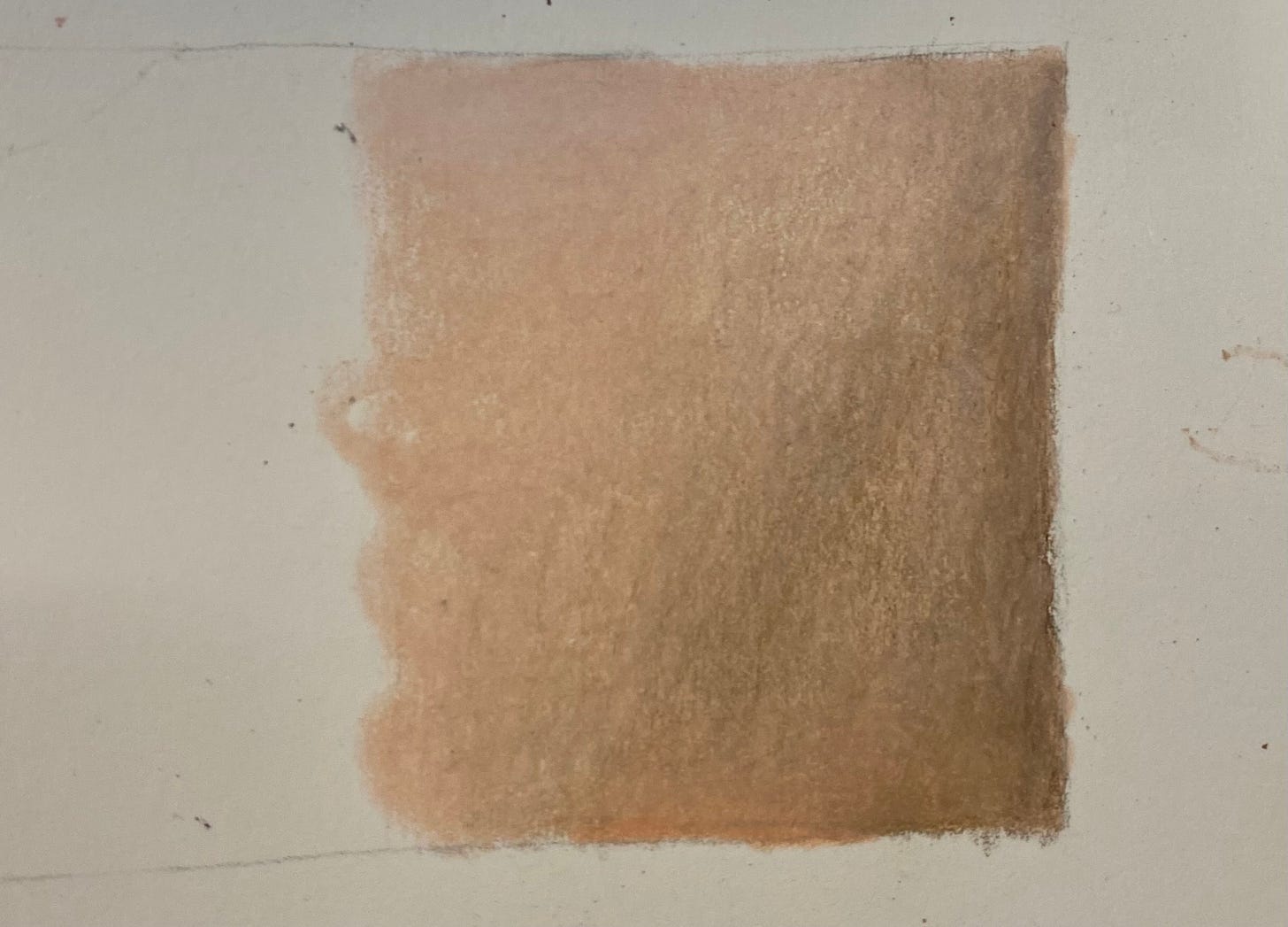
I first tried tones from Emma Stone as Cruella. The lips were better than the skin, which was too yellow and not pink enough.
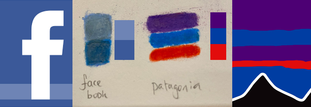
Second up were some famous company logos. Facebook was really challenging - I should probably have given up and started again, as the number of layers on the paper made it hard work. I do feel confident that with a bit more time I could get there.
Finally, I practiced drawing some skin tones, as well as a lot of messing around on scraps of paper.
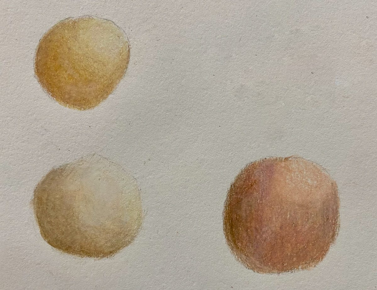
Could I mirror any shade in real life? Probably not. Is it good enough for photorealism for now? I hope so – especially on a larger scale.
Drawing a realistic eye
Next, to draw an eye, I followed this useful Youtube video:
I ended up drawing two eyes: one following the video step-by-step; the other trying to apply the process myself (which actually turned out better).
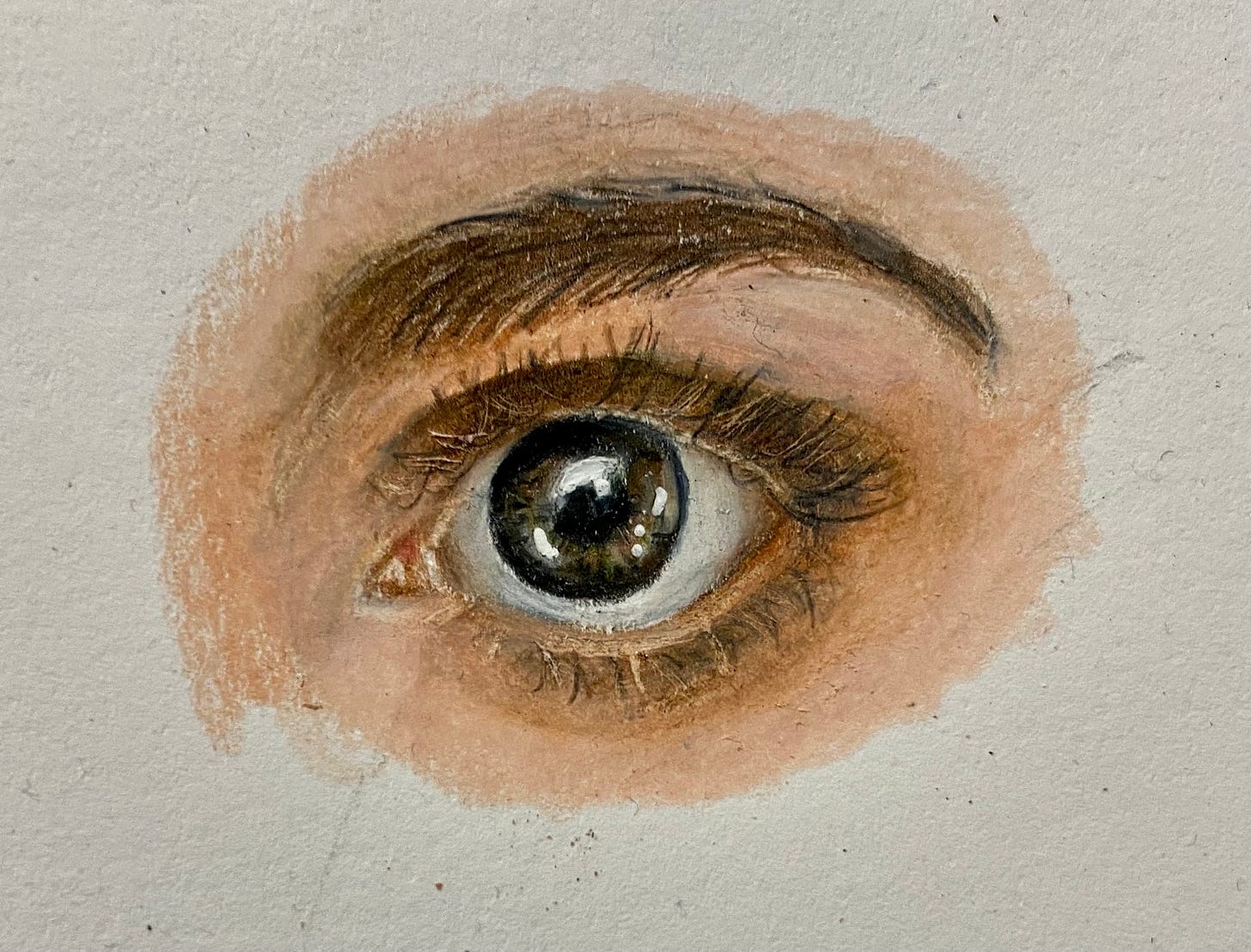
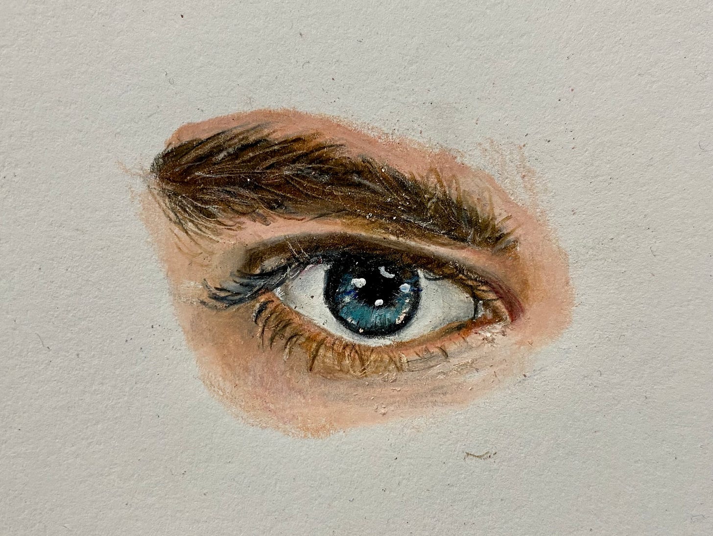
Overall, I’m really enjoying it so far. My eyes are not photorealistic, but I’m hoping the issues are with textures, blending and highlights, which I’ll be tackling in the next few weeks.
Week 2
This week I focused on :
- Shading — going smoothly from light to dark and applying even pigment to the paper
- Texture — to be able to create all the different textures in a face
- Realistic drawing of skin and a nose – using shading and texture
Here’s how it went.
Shading
There’s not much to say here besides:
- It’s hard
- I’m not very good at it
Here are some of my attempts:
To be fair, what’s hard isn’t going from light to dark in a single colour. It’s doing that while using multiple colours, changing them throughout. For example, going from dark brown to light peach, avoiding an abrupt end of brown is tricky.
Anyway, these are all small scale and my final image will be larger, so I should get away with it.
Texture
The textures I focused on were pores, wrinkles, and freckles and it turns out they’re all done in a similar way:
- Add a base layer of skin tone in the right colour and luminance
- Layer lots of small dots or lines on top in a range of dark and light colours. You can also use an eraser for lighter blemishes.
- Blend over the top with a lighter colour, so the blemishes fade into the skin. Apply more pressure for smooth skin and less for rough.
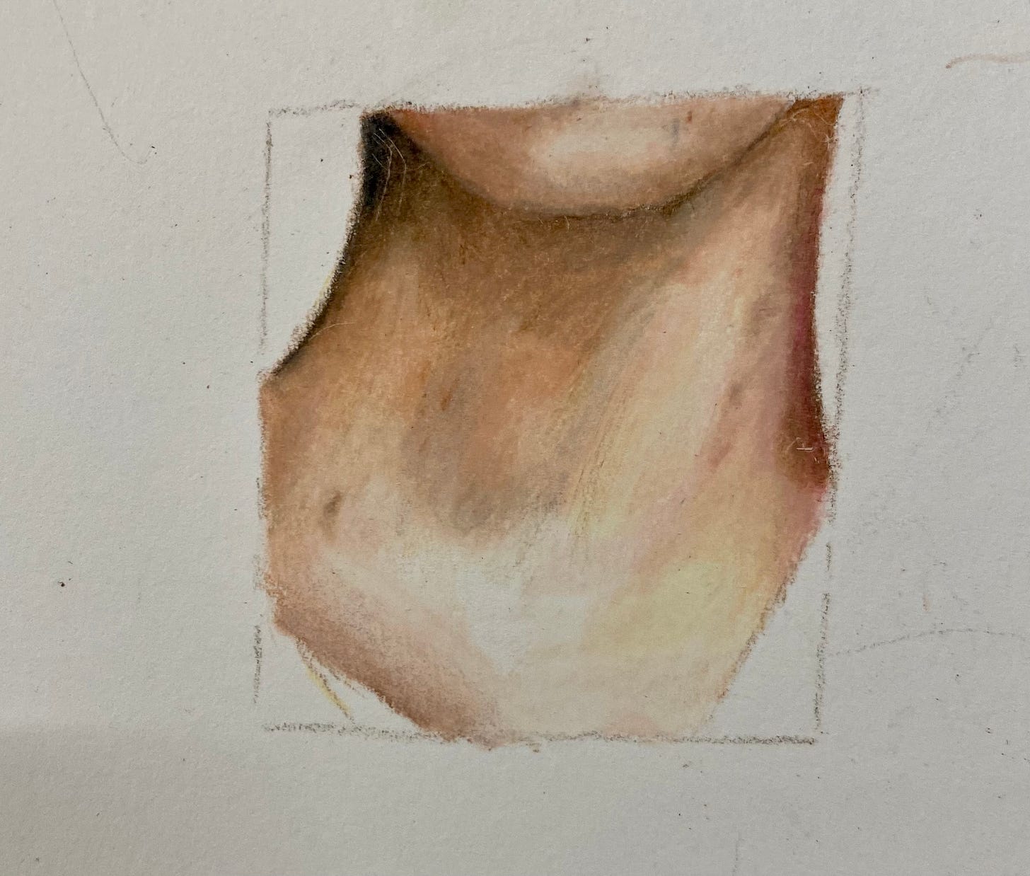
The nose below was my first attempt and it looks a bit clumsy — probably because it was also my first attempt at drawing a nose. However, most of my practice was on my final drawing, which you can see below.
Skin and nose
Finally, as well as drawing a realistic nose and surrounding skin, I also wanted someone with some texture to practice the above. This basically means someone older and (usually) male.
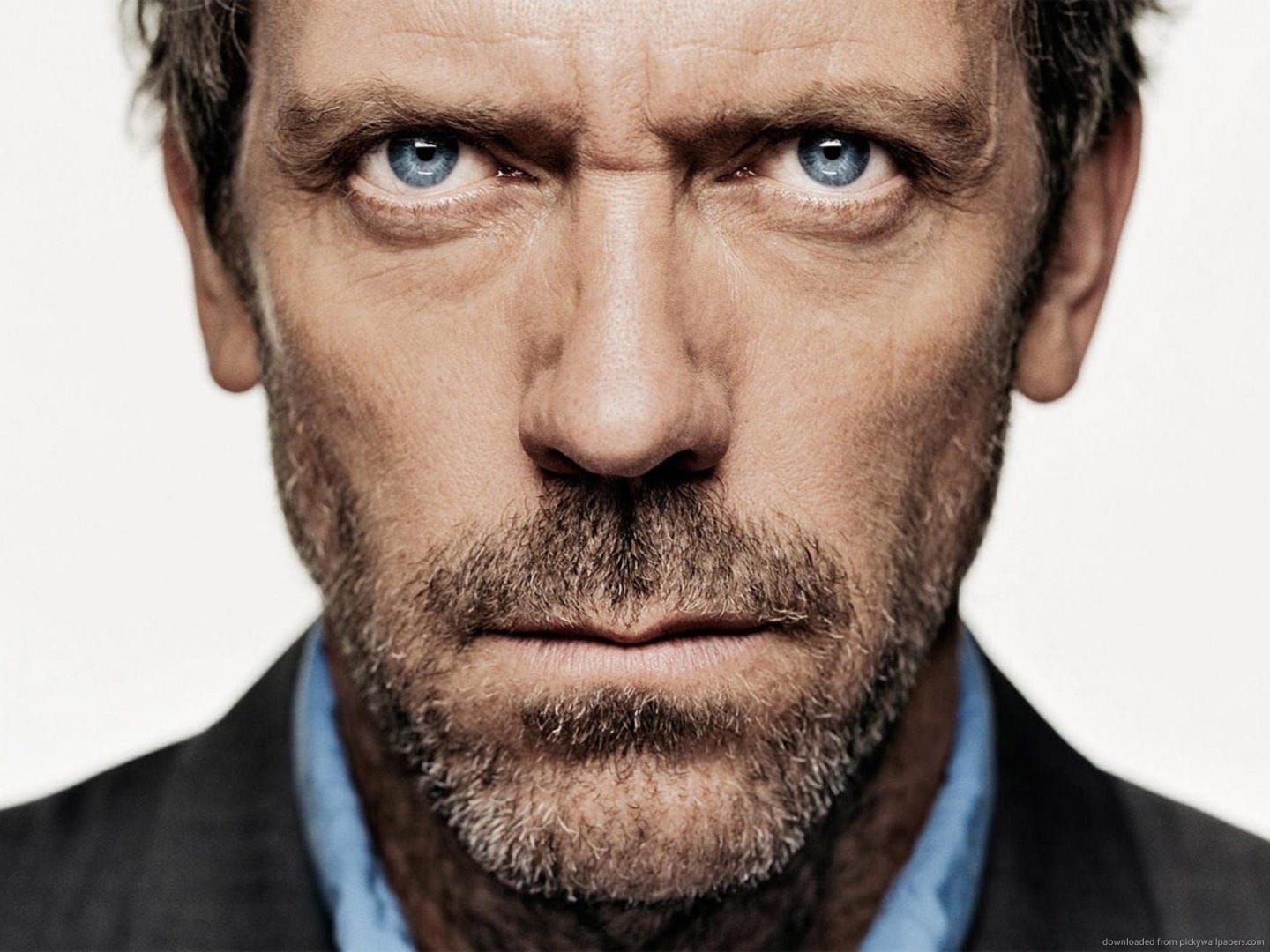
I ended up using this photo of Hugh Laurie:
Here’s the finished result:
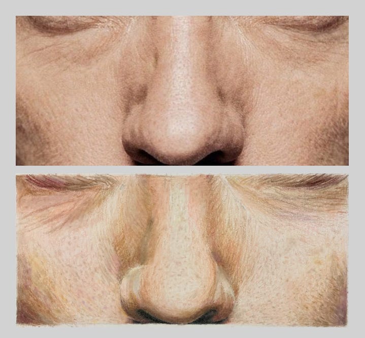
There’s definite progress! It’s interesting to pinpoint what doesn’t make it photorealistic. For me, it’s:
- Not pink enough — the original image has a pink tone across everything, while mine is more yellowy orange
- Not enough white blemishes — there are lots of dark blemishes on light, but no white ones, compared with the photo. This wasn’t from lack of trying! Partly it’s because the skin in general could be darker. And partly I blame my tools — I don’t have a small enough eraser, so I bought this fancy electric one for next week.
- Lines on either side of the nose are too prominent (and wrinkles in general) — looks a bit strange if you look closely
- Under eye wrinkles too sharp and purple
- Black not black enough
Today marks the halfway point, so I should probably get thinking about my final drawing. I still want to try a portrait, even if it makes it harder.
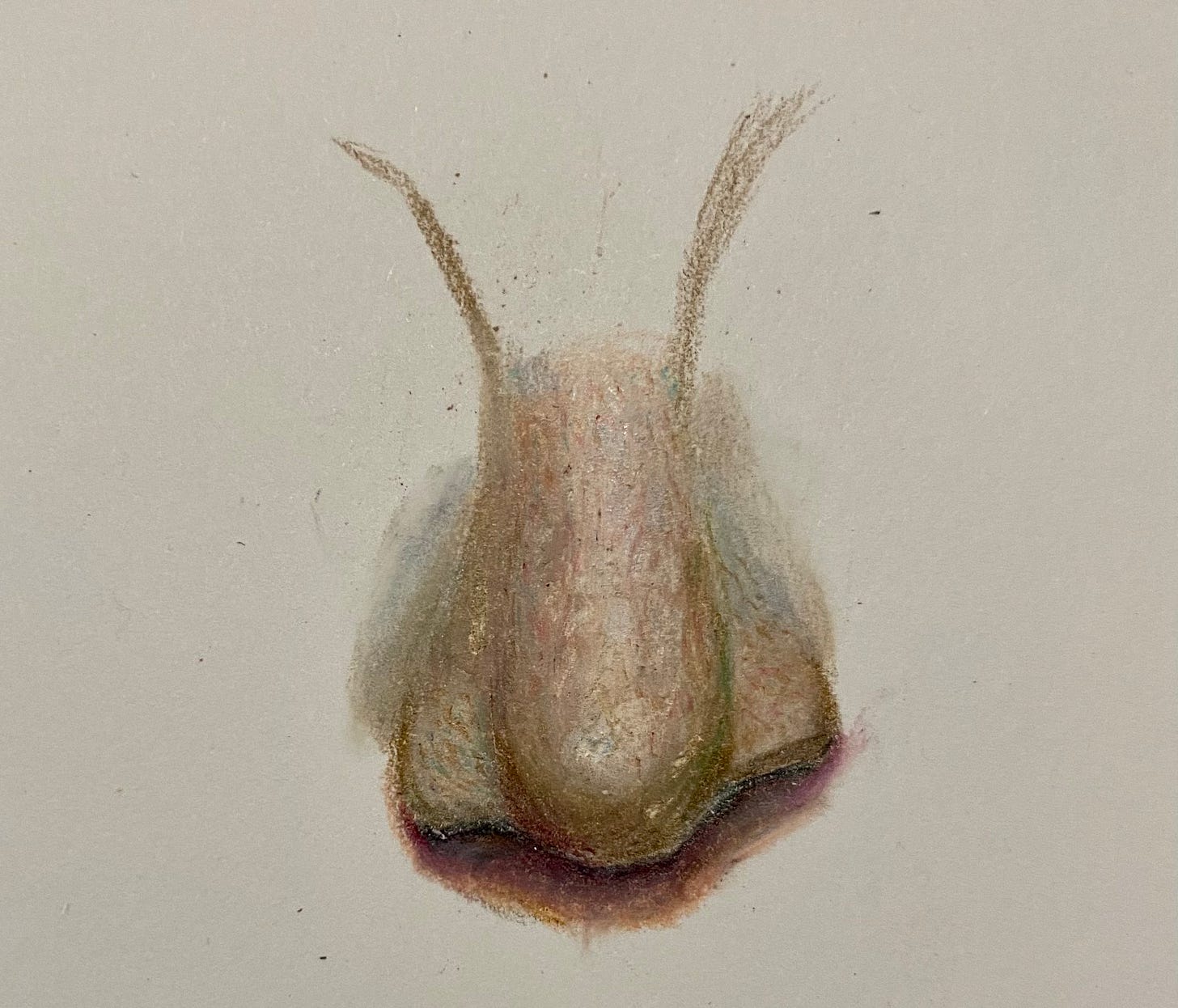
Week 3
Maybe drawing for 6 hours last Saturday was a mistake, as nothing could motivate me to pick up a pencil this week. As a result, I didn’t do many of the tasks I set myself — I am doing this for fun after all.
That said, here’s what I did manage.
Hair
As usual I had no idea how to go about drawing hair, so watched a few videos. They made it look easy, so I decided to have a go.
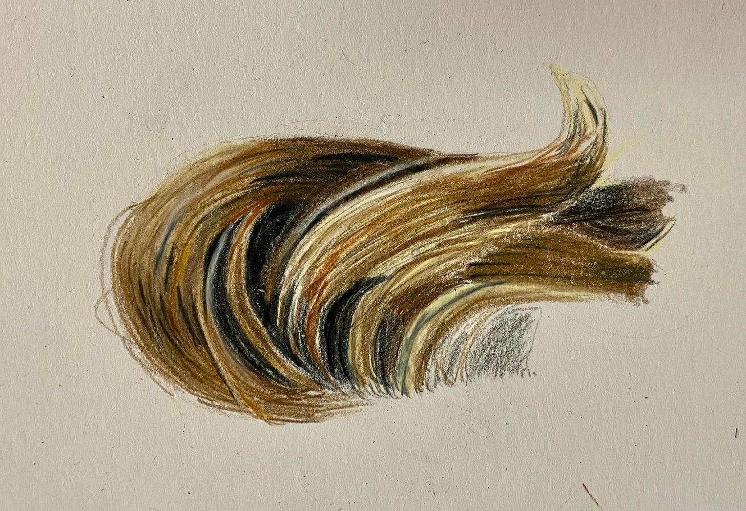
Not easy. I couldn’t even bring myself to finish it. The main two problems were:
- Pencils not sharp enough — you need sharp pencils to draw fine hairs. The pencils I bought are waxy Prismacolors, which lose their point quickly. I mistakenly thought I could get away without sharpening every minute or so.
- Not enough range of shadows — there’s black and then there’s light brown, but there’s not much in between. This makes the contrast look odd. It needs less black and more dark brown next time.
Below was my second attempt. A good addition was my hobby knife, which I used to scrape thin layers of pigment off the darker bits to imitate lighter hairs (e.g. see the top of the head). This helped create the 3D texture that hair needs.
In part, this went better as it was an easier hairstyle (darker, with less going on), but my practice must have helped. For my final image, I decided to pick another easy hairstyle (or no hair at all) to avoid any problems.
As for the other tasks:
- Blending — concluded it’s not totally necessary to learn — I had a play around with some nail varnish remover and it didn’t feel quite right, so at this late stage decided to drop it
- Lips — I’ll practice those next week as part of the final challenge. How hard can they be?
What next?
I’m looking forward to the final challenge. I’ve downloaded a long audiobook, sharpened all my pencils and am ready to go.
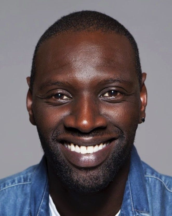
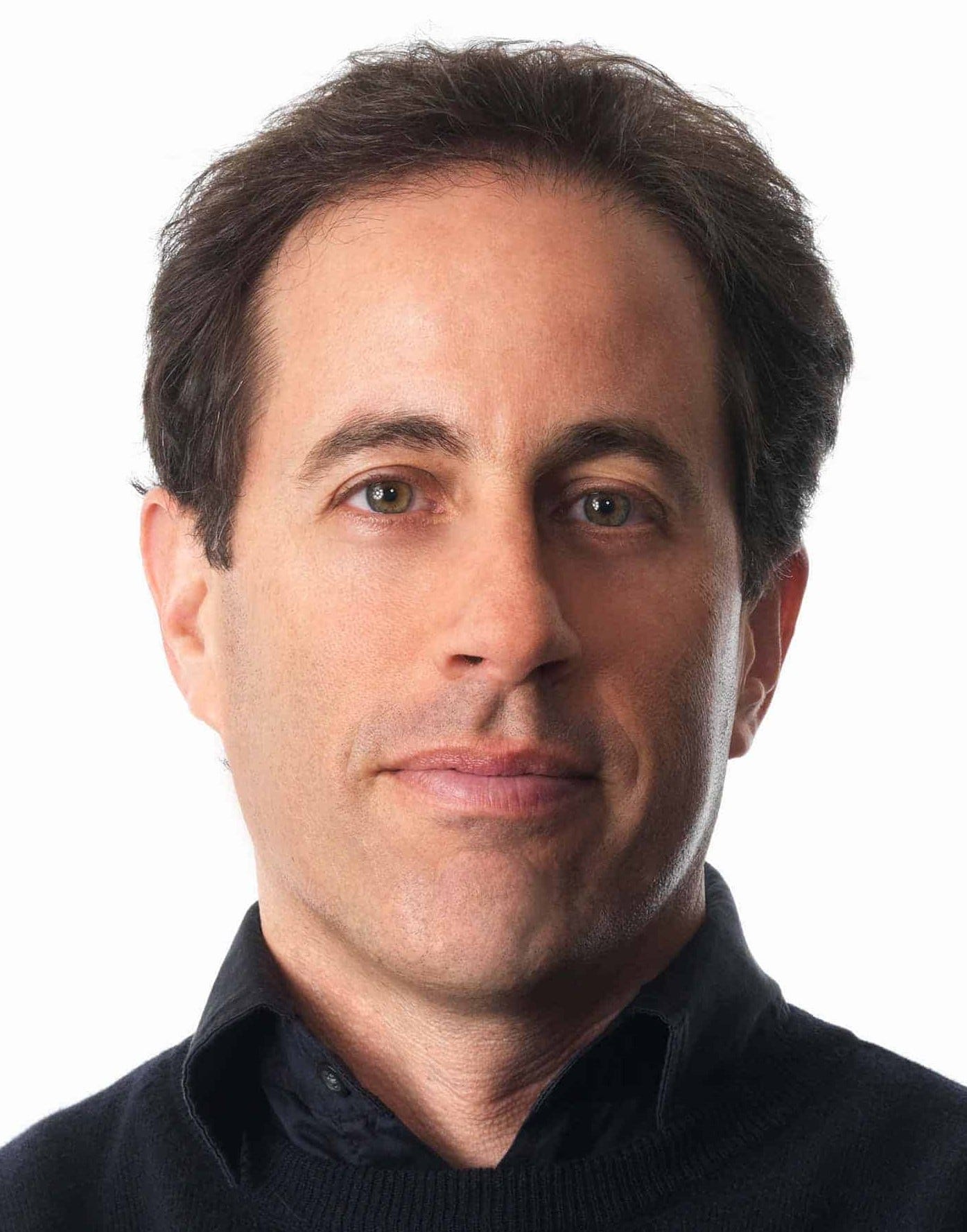
As for who I’m going to draw, I'm giving readers the choice.
The options are:
- A — Omar Sy
- B — Ana de Armas
- C — Jerry Seinfeld

Week 4
My task this final week was to:
- Draw my final picture
- Challenge 15 people to identify my drawing when compared with a photo (aiming to fool at least 3)
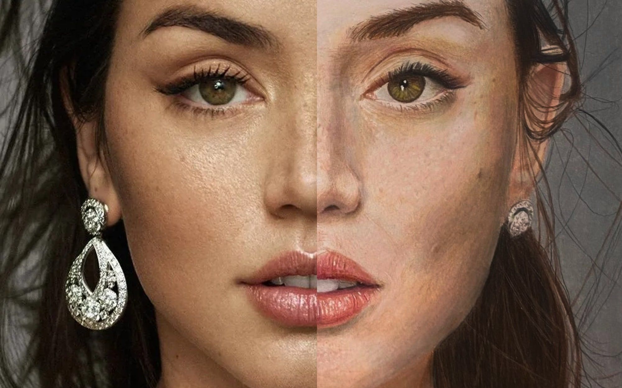
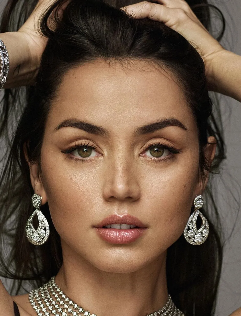
For whatever reason, the popular choice with readers was Ana de Armas (pictured below). Challenge accepted.
The biggest mistake was to underestimate how long it takes to realistically draw at A4 scale. If it took me 6+ hours to draw one eye (Week 1), a full face should have been impossible in a normal week.
Thankfully, I caught COVID and imposed a strict drawing lockdown. I’d have had no chance otherwise.
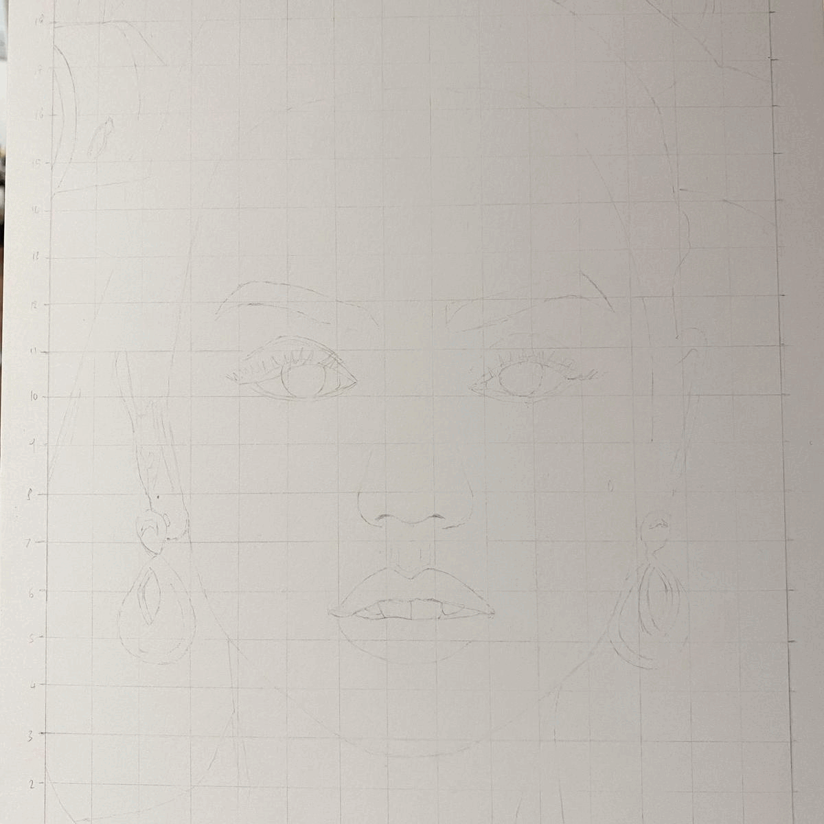
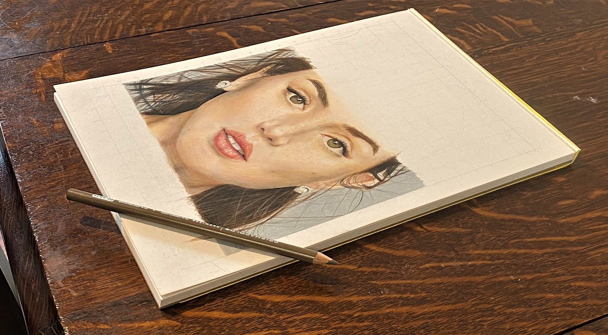
Midway through, I realised I could never complete the whole image in time, so cut my losses and the top off her head. Here’s what I ended up with:
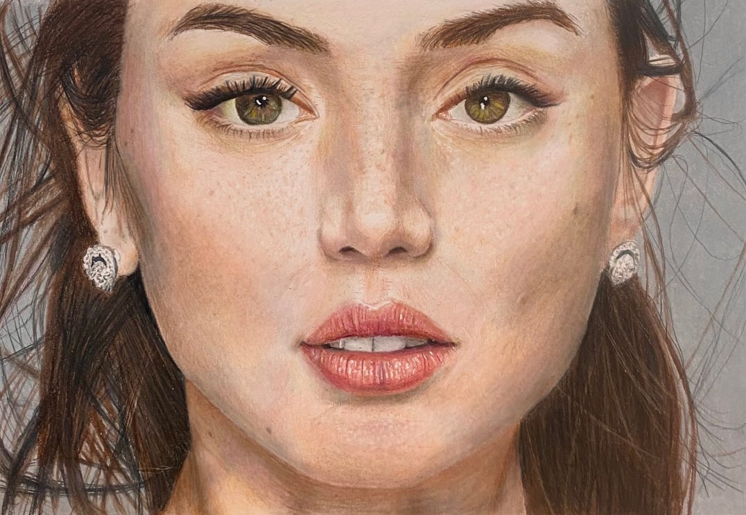
I used all the random tools I bought over the month:
- White gel pen — for eye pupils and lips
- Hobby knife — for flyaway hairs and texture in the eyebrows
- Electric eraser — for creating speckled texture on cheeks and below lips
- Kneaded eraser — for lightening the initial sketch so nothing showed through
I’m pretty happy with it. If you squint, you could certainly be fooled. Here are things I think I could improve next time:
- Finer hairs — my waxy pencils don't hold a sharp point, so don’t permit tapering / thin hairs – therefore, the eyelashes, eyebrows, and hairs are all the same width
- Better lips — the shape is wrong, making her look gormless rather than seductive; these were the first lips I had drawn, so I’m not too upset
- More nuanced left hand side of face
Also, if you compare it side-by-side with a real person, it’s missing some spark of life that I’ve no idea how to replicate.
The Challenge
Ok, great, but did I fool anyone?
To recap, I needed to show 15 people two images, one above the other, for 5 seconds. They had to tell me which one was the photo. If I could fool 3 or more people, then the challenge was a success.
Here were some of the comparisons I used to test people:
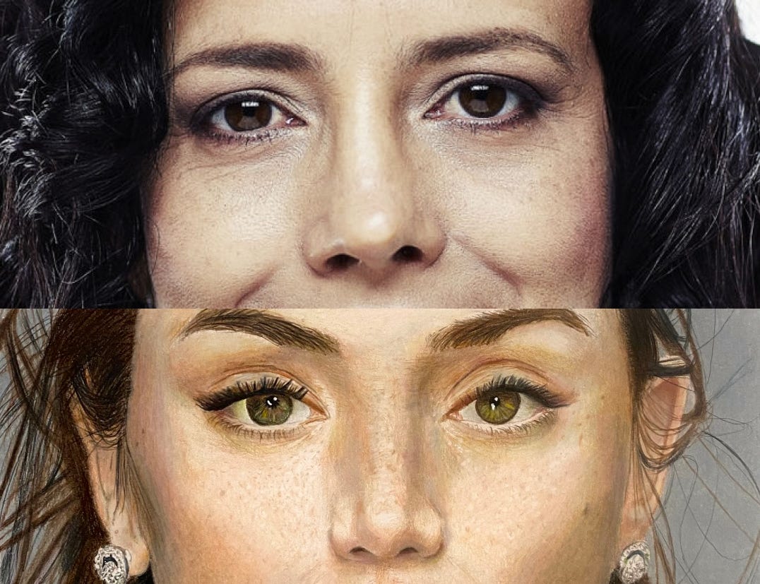
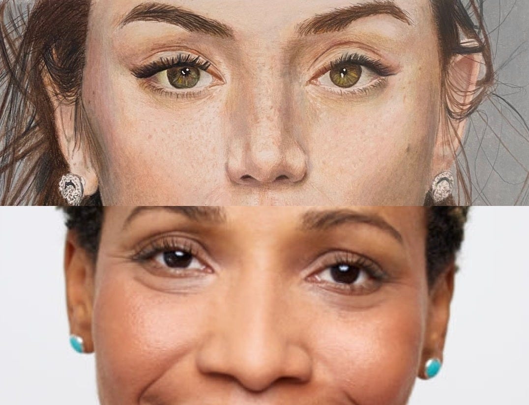
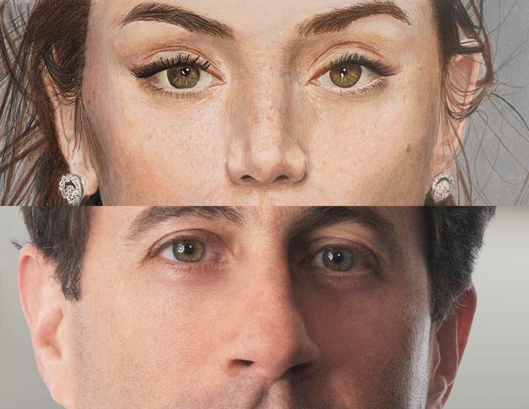
If you stare at any one for a bit of time, you’ll figure out which the photo is. For example: one of them’s blurry, so must be a photo; one has too complicated hair to be possible; you can see pencil strokes on the left side of the face, etc.
But ... long story short, the challenge was a success! I tested 13 people and 3 people got it wrong, so I stopped there.
Strangely, the most common answer was “I don’t know — they both could be”, but then to get it right when pushed. Of the 3 who got it wrong, when given more time, they got it right, suggesting I have a long way to go to actual photorealism.
Conclusion
In the end, I had three reflections:
- Drawing is a new class of meditative hobby for me — to draw a good piece, you need to spend a lot of time doing something essentially mindless. This month, I’ve drawn through the durations of 4 audiobooks — 100+ hours. You can’t rush and should stop if you feel yourself growing bored. As a result, it’s in the same class as knitting, jigsaws, fishing, baking — none of which I usually enjoy. Drawing has been surprisingly fulfilling.
- You learn to see people’s faces differently — for the first time, I’ve been able to describe the differences between a Western and Asian eye, high and low cheekbones, etc. I’ve started seeing faces as patterns of light and dark. As someone who struggles to recognise faces, I thought this would be useful, but honestly can’t notice any difference so far.
- This is not proper art — it’s more a technical skill. Art is taking a series of decisions to convey the essence of something. This happens in two stages: 1) what you choose to depict and 2) how you choose to depict it. Photorealism only has the first stage (e.g. what you choose to draw, the composition of the piece). I'd like to further explore the second.